Five Tips For Creating Custom Signs
Looking to create standout custom signs for your business? You’ve come to the right place. Today at SIGN-U, we review the research to highlight 5 best practices for custom sign design.
Read on to learn more, or call (317)-733-5800 to speak directly with a custom sign designer near you.
5 Tips To Create Standout Custom Signage In Indianapolis, IN
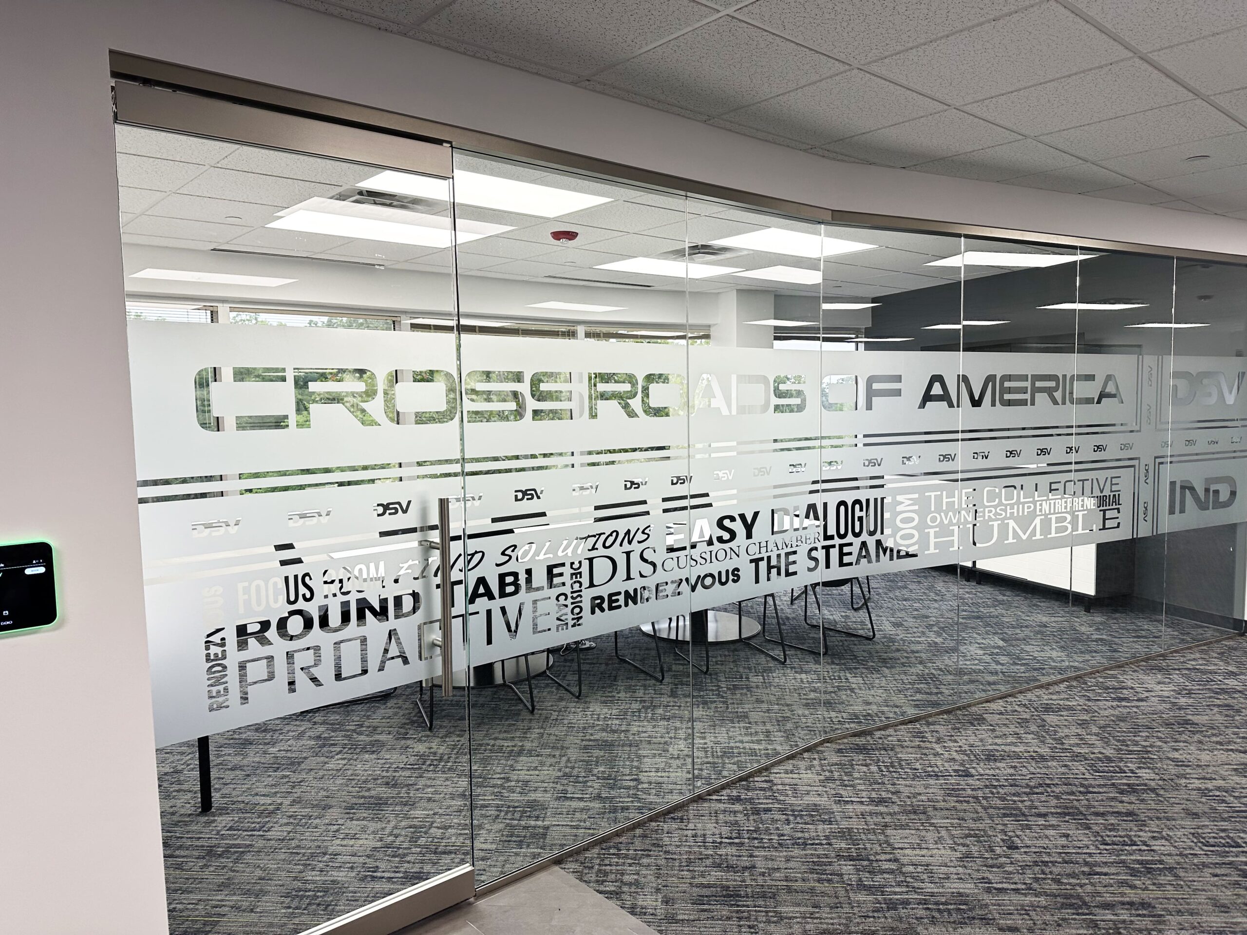
1. Create A Visual Hierarchy To Highlight What Matters Most
In a visual hierarchy, design elements are arranged to show their order of importance. This not only looks great, adding visual interest and breaking up the messaging monotony to draw eyes; it also ensures your audience sees what matters most.
“When all elements are of equal weight, they demand equal attention,” writes Connie Malamed (2015) in her book, Visual Design Solutions. “Your message may be lost when nothing has prominence. A designer’s job is to provide an obvious path for the viewer’s eyes to follow.”
Beyond creating a literal visual hierarchy, where the most important elements come first, you can make parts of your messaging more prominent by:
- Using distinct fonts to highlight key words, brand names, or important value propositions
- Enlarging important images or keywords in your sign copy
- Adding attention-grabbing visual elements, like underlines, circles and borders, or graphics pointing towards key parts of your message
- Writing important messages in a different color
2. Keep Your Design Bold And Simple To Invite Onlookers
Complex, info-rich signs can be very useful in some contexts, like when customers want to know more about products with minimal packaging or learn about displays in museums and galleries.
But when it comes to branding, basic wayfinding, and sales promotion, simple designs reign supreme.
Indeed, plenty of research now bears out the value of that prickly old design adage, Keep It Simple, Stupid! (K.I.S.S). For example:
- In a study for the Interdisciplinary Journal of Signage and Wayfinding, researchers Knuth et al. (2020) deemed that “less complex stimuli are generally easier to process, resulting in higher fluency” (p. 8)
- Research by the Journal of Retailing found that “lower complexity enhances the perceived attractiveness of the advertiser” (Orth & Crouch, 2014).
- In one study measuring the factors affecting consumer product choices, Etyam et al. (2017) found simple signage was “easiest to use,” placing less cognitive burden on the viewer and improving emotional responses to brand messaging.
With so many different fonts, colors, and graphic options at your fingertips, it can be easy to overdo it, but the Indy Sign Factory is here to help.
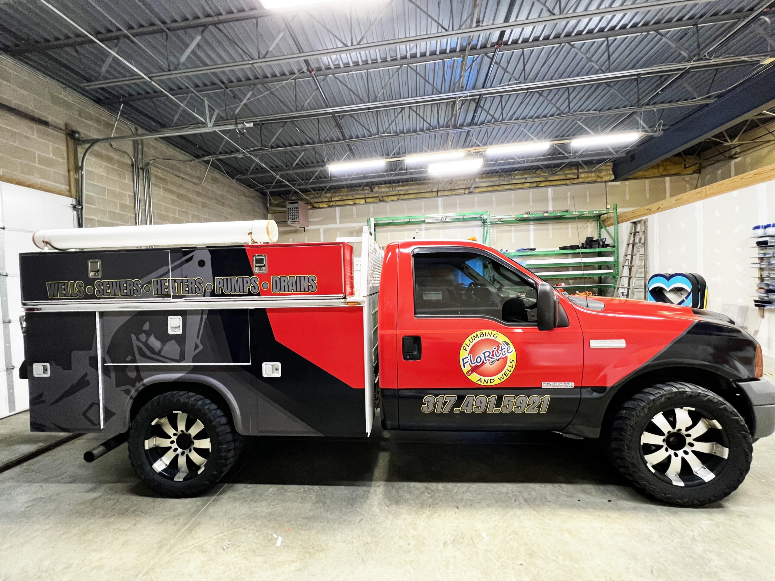
3. Crank Up The Contrast For More Conspicuous Messaging
If you want your signage to stand out from Indianapolis’ competitive signscape, make sure to crank up the contrast.
In “Factors Affecting Sign Visibility, Conspicuity and Legibility,” a deep dive into decades of sign research, James Bullough (2017) concluded that “the contrast between a sign and its immediate background is the primary determinant of one’s ability to detect that sign, perhaps more than size.”
Accordingly, you should always try to maximize the contrast between your sign message and substrate, whether you use contrasting colors (e.g. red-on-white, white-on-blue, yellow-on-black) or illuminated letters on an opaque background.
4. Size Your Sign Message Appropriately For Your Target Audience
To achieve standard legibility levels, the United States Sign Council Foundation suggests making your sign letters 1” tall for every 30’ of viewing distance, but this general recommendation won’t apply to every display context.
The right size for your sign message depends on your target audience. Are you advertising to in-store shoppers, passing pedestrians, or drivers? In other words, how far away are your viewers, and how fast are they moving?
If you need help perfecting your specs, the Indy Sign Factory team is standing by to help.
5. Use The Psychology Of Color To Convey Quality And Character
Color not only creates contrast; it also conveys the quality and character of your brand at-a-glance.
“The psychology of color and quality logo design often gives certain products… a good brand personality in the minds of consumers,” write Suriadi et al. (2022) in a report for Linguistics and Culture Review. “On the other hand, improper design and low-quality logo colors give the impression of a low personality brand.”
Color psychology studies have identified plenty of evocative colors you can use to express your brand’s values and focus area—green for nature, money, and freshness; blue for peace, integrity, and productivity; orange for innovation, creativity, and excitement; the list goes on and on.
If you’re not sure where to begin, our team is standing by. We can help you choose the perfect fit for your brand personality or marketing message, and our photo spectrometer device guarantees perfect color matching with any existing brand materials.
Create Custom Signs In Indianapolis, IN: Book A Free Consultation
The Indy Sign Factory is your friendly local sign factotum, offering a wide range of sign services, plus one of the area’s largest selections of customizable sign products, so you can do it all under one roof.
Whatever you order, we guarantee:
- Complete customization—Leverage our state-of-the-art printer and broad selection of sign materials, finishes, fonts, and color options to fulfill any design vision.
- Perfect color matches—Our sophisticated photo spectrometer delivers exact color matches for seamless sign integration, repairs, and branding integrity.
- Full support with your order—No experience? No problem! Our dedicated sign experts will walk you through every step of the process, from creative ideation to final installation.
To begin your custom sign order, call (317)-733-5800, email contact@IndySignFactory.com, or submit your artwork files directly to our graphic department.
References
Bullough, J. (2017). Factors affecting sign visibility, conspicuity, and legibility: Review and annotated bibliography. Interdisciplinary Journal of Signage and Wayfinding, 1(2), 2-25.
Eytam, E., Tractinsky, N., & Lowengart, O. (2017). The paradox of simplicity: Effects of role on the preference and choice of product visual simplicity level. International Journal of Human-Computer Studies, 105, 43-55.
Knuth, M., Behe, B. K., & Huddleston, P. T. (2020). Simple or complex? Consumer response to display signs. Interdisciplinary Journal of Signage and Wayfinding, 4(2), 7-22.
Malamed, C. (2015). Visual design solutions: Principles and creative inspiration for learning professionals. John Wiley & Sons.
Orth, U. R., & Crouch, R. C. (2014). Is beauty in the aisles of the retailer? Package processing in visually complex contexts. Journal of Retailing, 90(4), 524-537.
Suriadi, J., Mardiyana, M., & Reza, B. (2022). The concept of color psychology and logos to strengthen brand personality of local products. Linguistics and Culture Review, 6, 839-856.
Back